


I love this coloring book and sticker kit idea by Sanithna Phansavanh. 
.............................................................................................
Blog Jouons 
Showing posts with label color. Show all posts
Showing posts with label color. Show all posts
Friday, March 07, 2008
Coloring book

Tuesday, October 09, 2007
Use 1915's conventions: Pink for boys and blue for girls!

Sony is a visionary: the use of a stronger color for its ps2!
I found an article 11 Great Color Legends on Colour Lovers. An excerpt:
According to the website “Gender Specific Colors,” it would seem that assigning color to gender is mostly a 20th century trait. It would also seem that at one time, the color associations were reversed when color first came into use as a gender identifier.
In fact, this reversal of what we consider “normal” was considered conventional, even in the early 20th century.
“At one point pink was considered more of a boy’s color, (as a watered-down red, which is a fierce color) and blue was more for girls. The associate of pink with bold, dramatic red clearly affected its use for boys. An American newspaper in 1914 advised mothers, “If you like the color note on the little one’s garments, use pink for the boy and blue for the girl, if you are a follower of convention.” [The Sunday Sentinal, March 29, 1914.]
“There has been a great diversity of opinion on the subject, but the generally accepted rule is pink for the boy and blue for the girl. The reason is that pink being a more decided and stronger color is more suitable for the boy, while blue, which is more delicate and dainty, is prettier for the girl.” [Ladies Home Journal, June, 1918]
According to Jo B. Paoletti and Carol Kregloh, “The Children’s Department,” in Claudia Brush Kidwell and Valerie Steele, ed., Men and Women: Dressing the Part, (Smithsonian Institution Press, 1989). - In the United States: “The current pink for girls and blue for boys wasn’t uniform until the 1950’s.
Wednesday, July 25, 2007
Abstract by Joëlle Bitton

Abstract is the upcoming interaction installation by Joëlle Bitton at Gallery EF in Tokyo.
On the theme of waiting and the perception of the time passing-by: inviting visitors in a space where the body and its movement play the role of interfaces. From a point of view on the Japanese garden and its vision on the surrounding, aesthetic and philosophical world, this project is inspired by the tension between elements intentionally thought here in a contradictory dialog: abstraction and texture, concealment and disclosure, empty space and framed space. This installation places the visitor on the razor's edge: always on the border, between two worlds, passing from one to the other. This is the experience of difference and of a fragile balance, of what is called in the Japanese culture, the impermanence of things. The latter is then staged in a relationship to the cycle of time, to the emotions that the expectation of something to happen can generate.
Joëlle's portfolio
Tuesday, July 24, 2007
Transformable Toys

It started with transformable sculptures: The “expanding geodesic dome” from 1991 at the Liberty Science Center in New Jersey - Via Pingmag
Last time I visited her in San Francisco, my friend Kimiko Ryokai gave me this awesome toy. A ball that changes its shape and color when flipped in the air! This tricky toy was invented by the famous kinetic sculptor Chuck Hoberman. An interview on Pingmag recently covers his background, creations and inspirations. 
Switch Pitch by Chuck Hoberman. Image from Educational Innovations
Sunday, July 22, 2007
Music videos: after the e-baby ...

E-baby Produced by Pleix / Chased by Cowboys. Music: Bleip. 2003.
Beauty kit Produced by Pleix. Music: Bleip. 2001.
Music videos that mainly deal with the question of the influence of technology on our lives such as biotechnology, media and plastic surgery, etc ... Pleix is a virtual community of digital artists -3d, musicians, graphic designers- based in Paris. I like their progression from the beauty kit, the e-baby: how to order a baby online, to birds as flying dogs: the imagery is stunning, to the complete human assimilation of freaky gigantic robotic-plastic rabbit.
Birds Produced by Pleix / Blink. Music: Vitalic. PIAS. 2006.
All their videos.
Check also Régine Debatty's report on Pleix's talk.
E-baby video
Tuesday, July 17, 2007


Tuesday, May 22, 2007
Informational diagrams

Another master piece in the domaine of graphic representation of information. Best informational diagrams edited by Pie Books
Graphs, charts, maps, schematics… a collection of the latest in graphics that visualize complex information thus making it easy to comprehend. This wide range of diagram masterpieces from around the world documents the state of the art.


Thursday, April 13, 2006
Wall color changes for therapy?
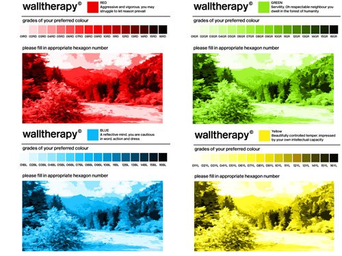
Walltherapy is research on design methodology for bespoke, end-user created designs that can have a positive effect on their environment. Based on research that states that ambient color, light and texture can affect mood, Walltherapy invites anybody to use their favorite colors to create their own environment.
Walltherapy is an empirical exploration of the neurological, cognitive and contextual bases underpinning the impact of visual stimuli such as colour and light and how people's mood can be expressed in design through a creative, scientifically-led design process

More about the project
In color therapy
Subscribe to:
Posts (Atom)
